Technologies We Use
Modern tools for analytics, dashboards, automation, and AI solutions.
YC Analytics helps businesses turn complex data into clear insights using analytics, dashboards, and machine learning.
Modern tools for analytics, dashboards, automation, and AI solutions.
We help businesses make sense of their data through powerful analytics, visualization, and data-driven strategies that uncover opportunities and improve performance.
View All Services →Descriptive, predictive, and prescriptive analytics, dashboards, and AI-powered spreadsheet optimization to drive smarter decisions.
End-to-end software configuration management, keeping your data projects on track, on scope, and on budget.
Compelling presentation design and technical writing that communicate your data story to any audience.
A sample of dashboards, data visualizations, and presentations we've built to turn complex data into clear decisions.
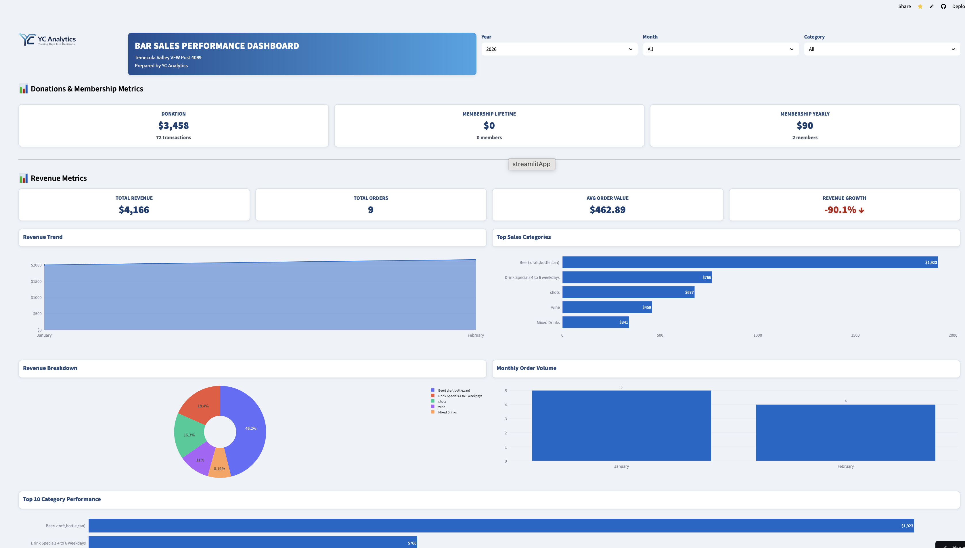
Interactive dashboard analyzing retail beverage sales with KPI tracking, monthly trends, revenue breakdown, and automated PDF executive summary. Built with Python, Plotly & Streamlit.
View Project →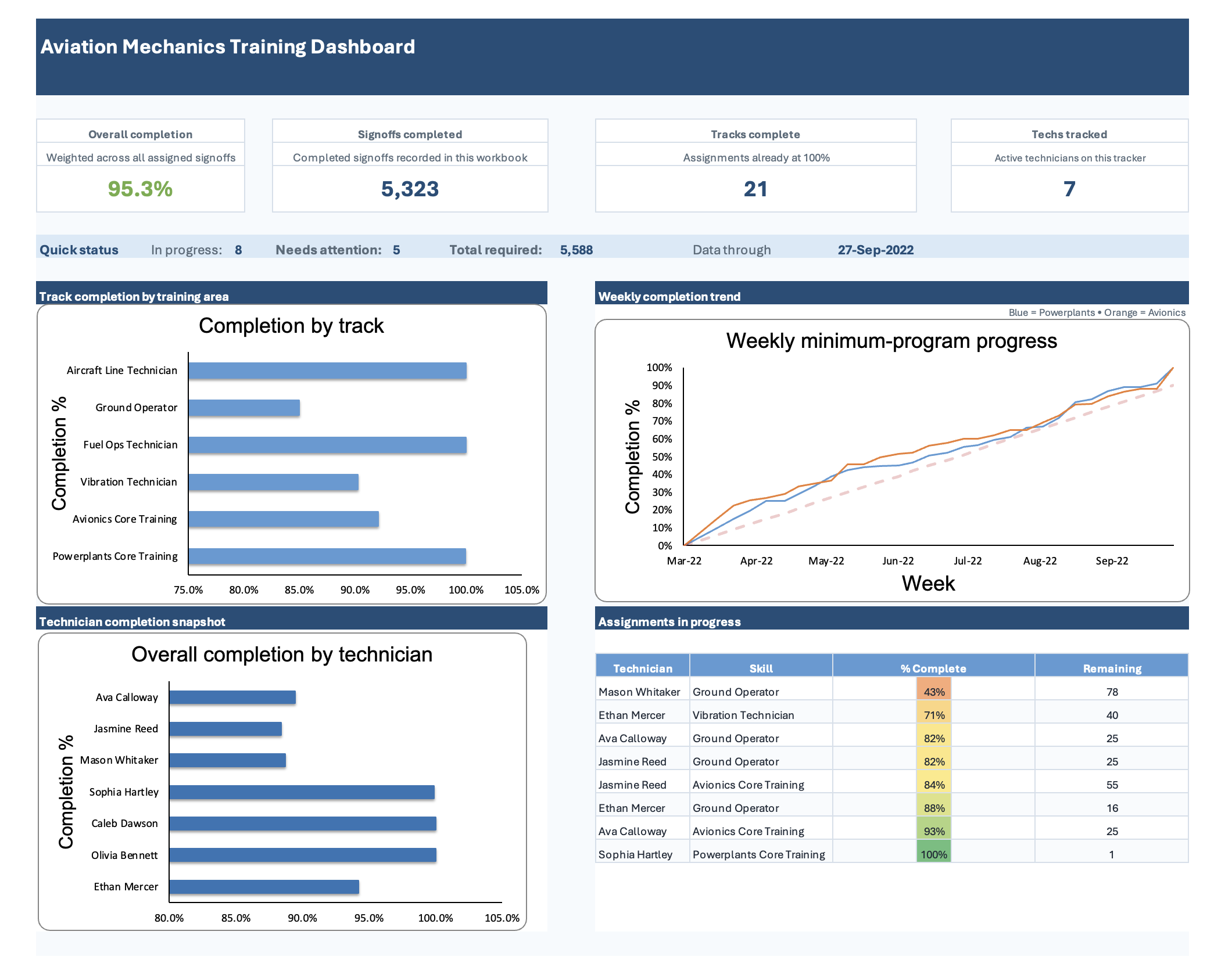
Excel dashboard tracking 5,323+ signoffs across 21 training tracks for 7 technicians, showing completion trends, performance, and progress vs. targets.
View Project →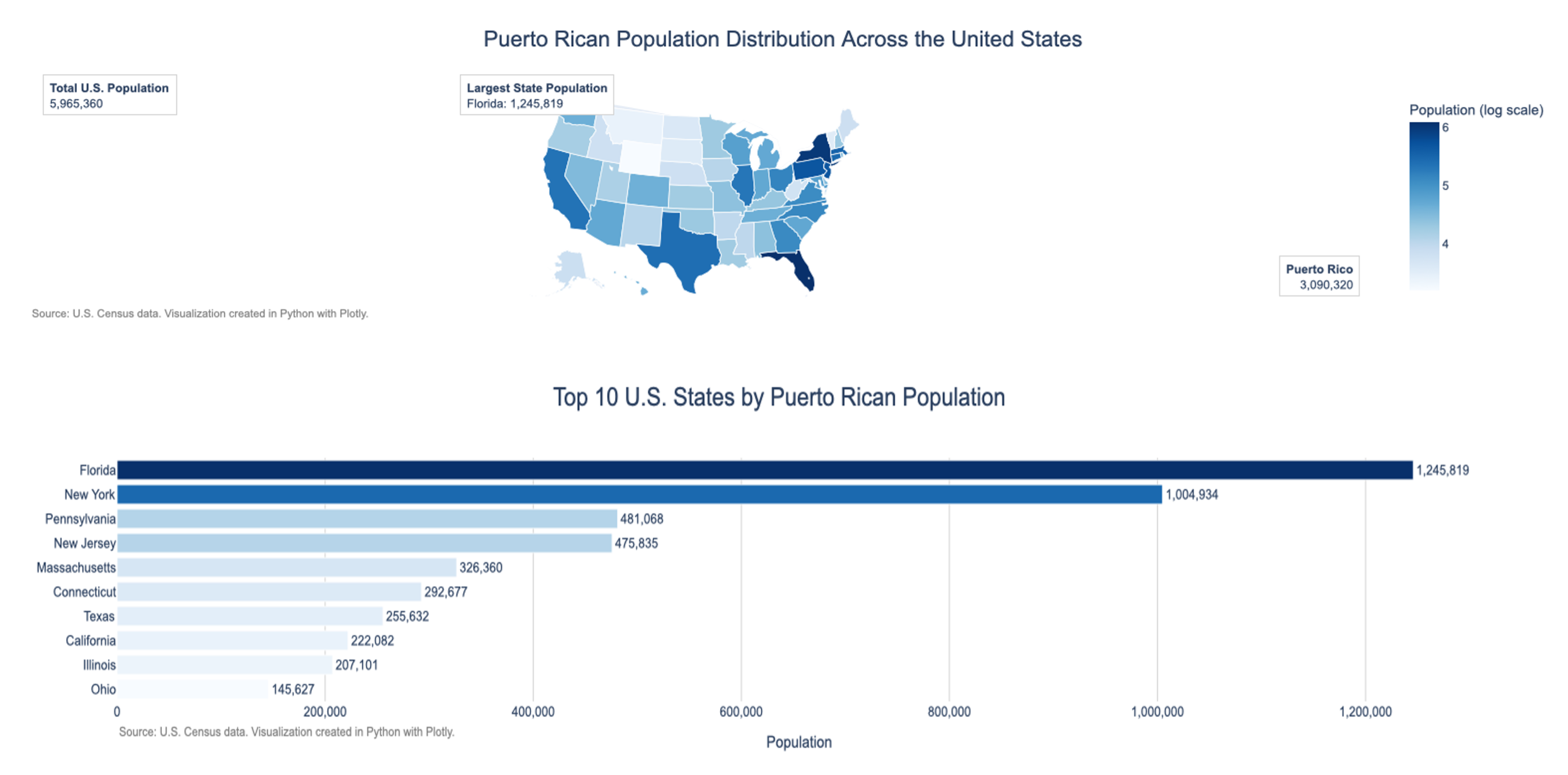
Demographic dashboard using U.S. Census data, featuring a choropleth map and Top 10 states bar chart with logarithmic scale. Built with Python, Pandas & Plotly.
View Project →A closer look at how YC Analytics transforms raw data into reporting tools, dashboards, and decision-ready insight.
Management needed a faster way to understand revenue drivers, seasonality, and category performance without digging through spreadsheets.
An interactive dashboard with KPI cards, executive recommendations, and PDF export turned static data into a reusable monthly reporting tool.
Read case study → Operational ReportingLeadership needed a clearer way to monitor qualification progress, weekly performance, and lagging training areas inside Excel.
The redesigned dashboard improved visibility into progress tracking, readiness trends, and where supervisors should focus attention.
Read case study → Data VisualizationRaw demographic data needed to become a clear visualization that could support market targeting, planning, and resource allocation.
A choropleth map and ranked comparison view surfaced concentration patterns and growth opportunities across U.S. markets.
Read case study →